The Tech Museum, located San José, CA
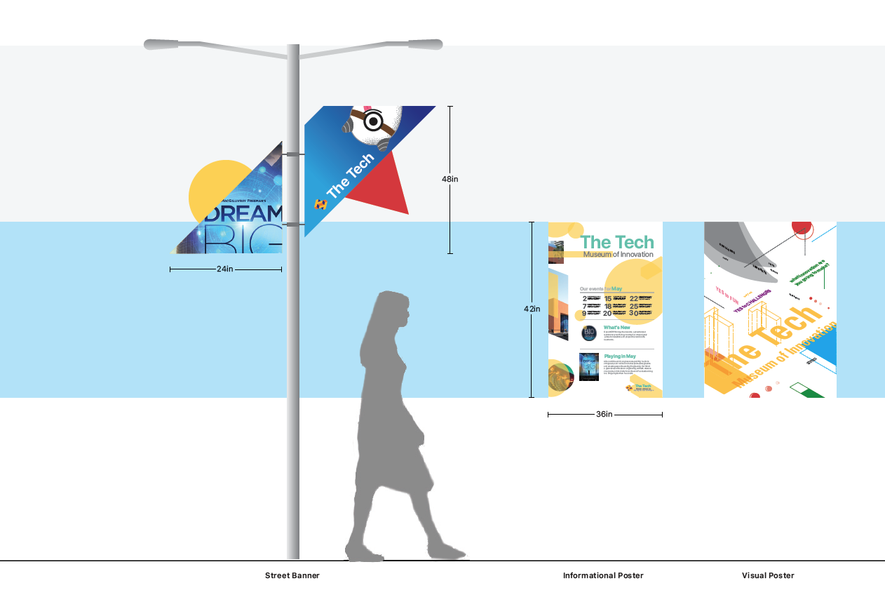
Our project at The Tech Museum focused on enhancing the visitor experience through a thoughtfully designed wayfinding system. Our goal was to create a seamless, engaging journey that not only made navigation effortless but also deepened visitors' connection to the museum’s mission of innovation and learning—all while keeping the experience fun and intuitive.
Solution: We developed clear, visually engaging signage that harmonized the museum’s historical and modern spaces, ensuring every visit felt both memorable and educational.
Role: Environmental, brand, signage and wayfinding
Team: Tim Duong, Phuong Ngn
Brand Identity
Environmental
Signage / Wayfinding
Field Reserch
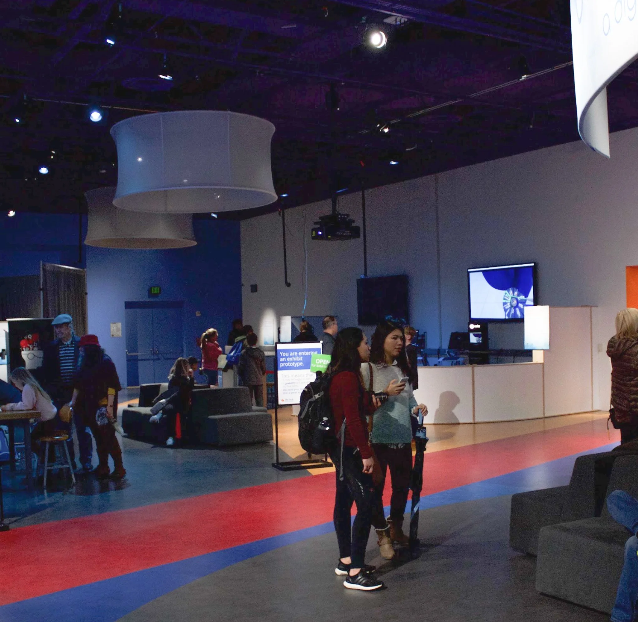
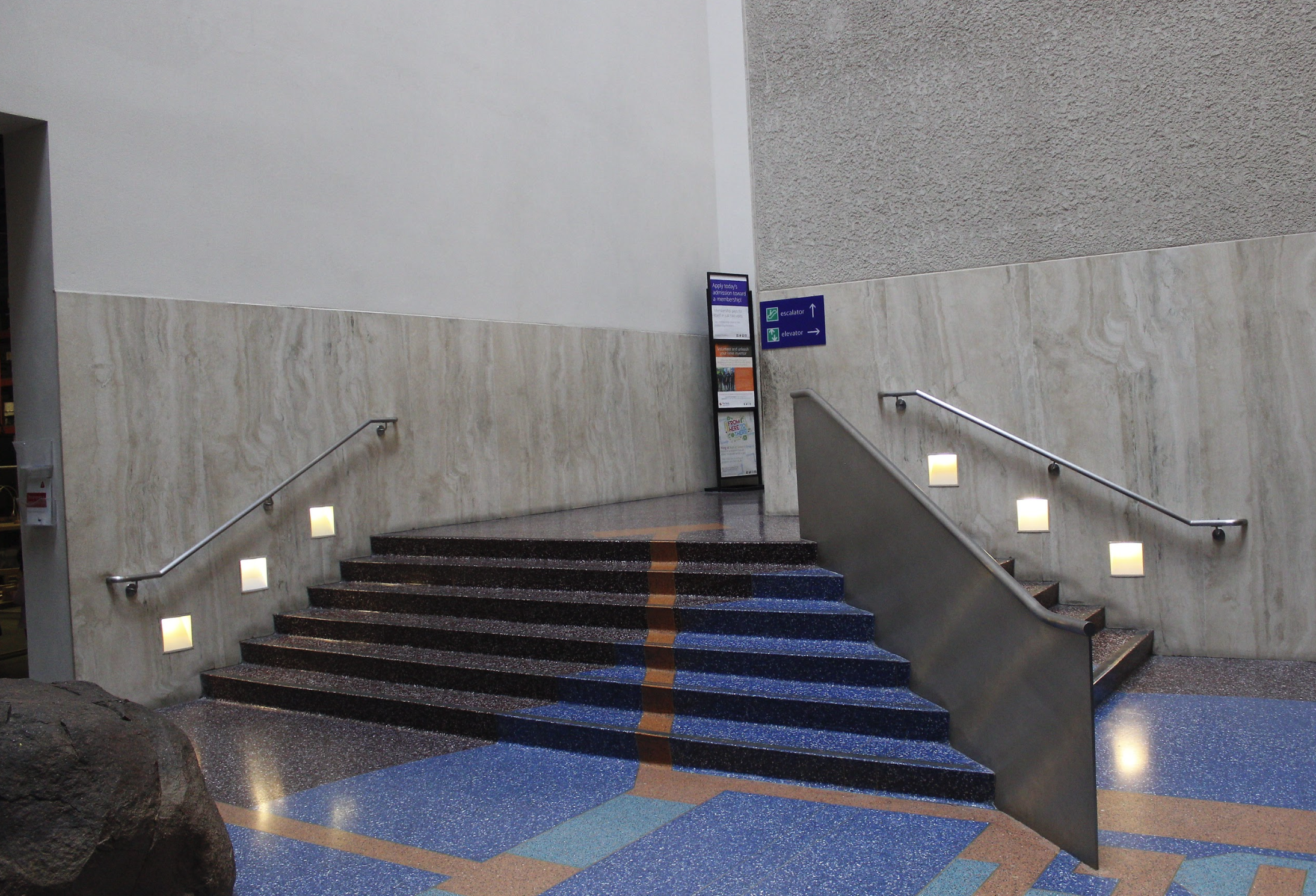
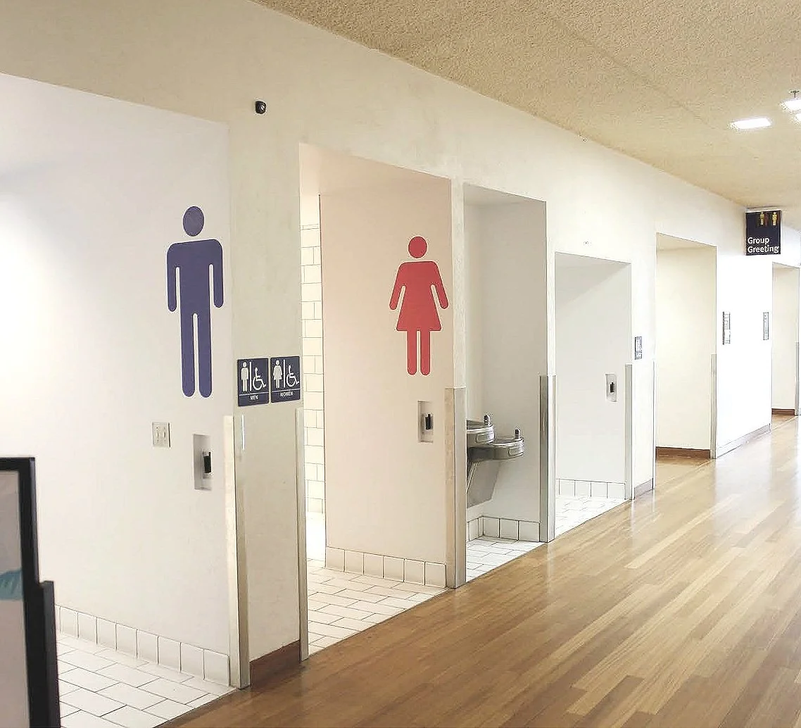
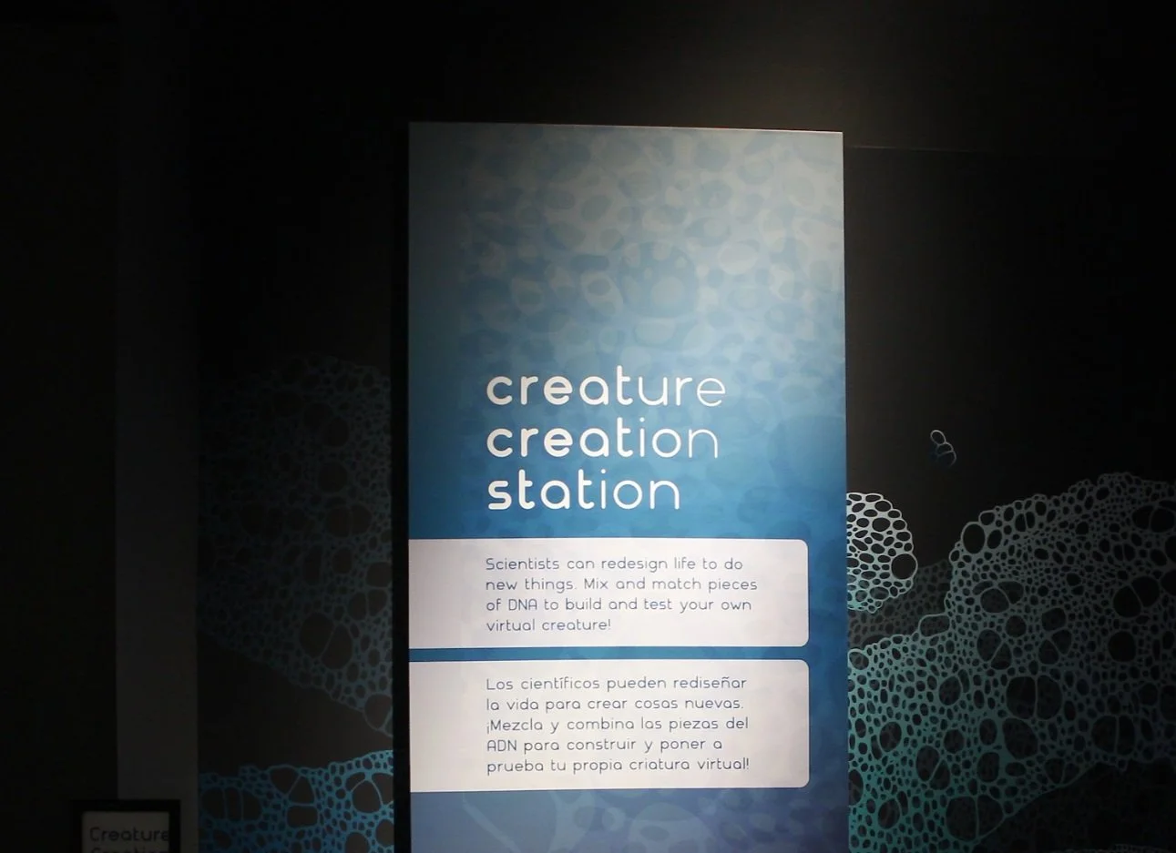
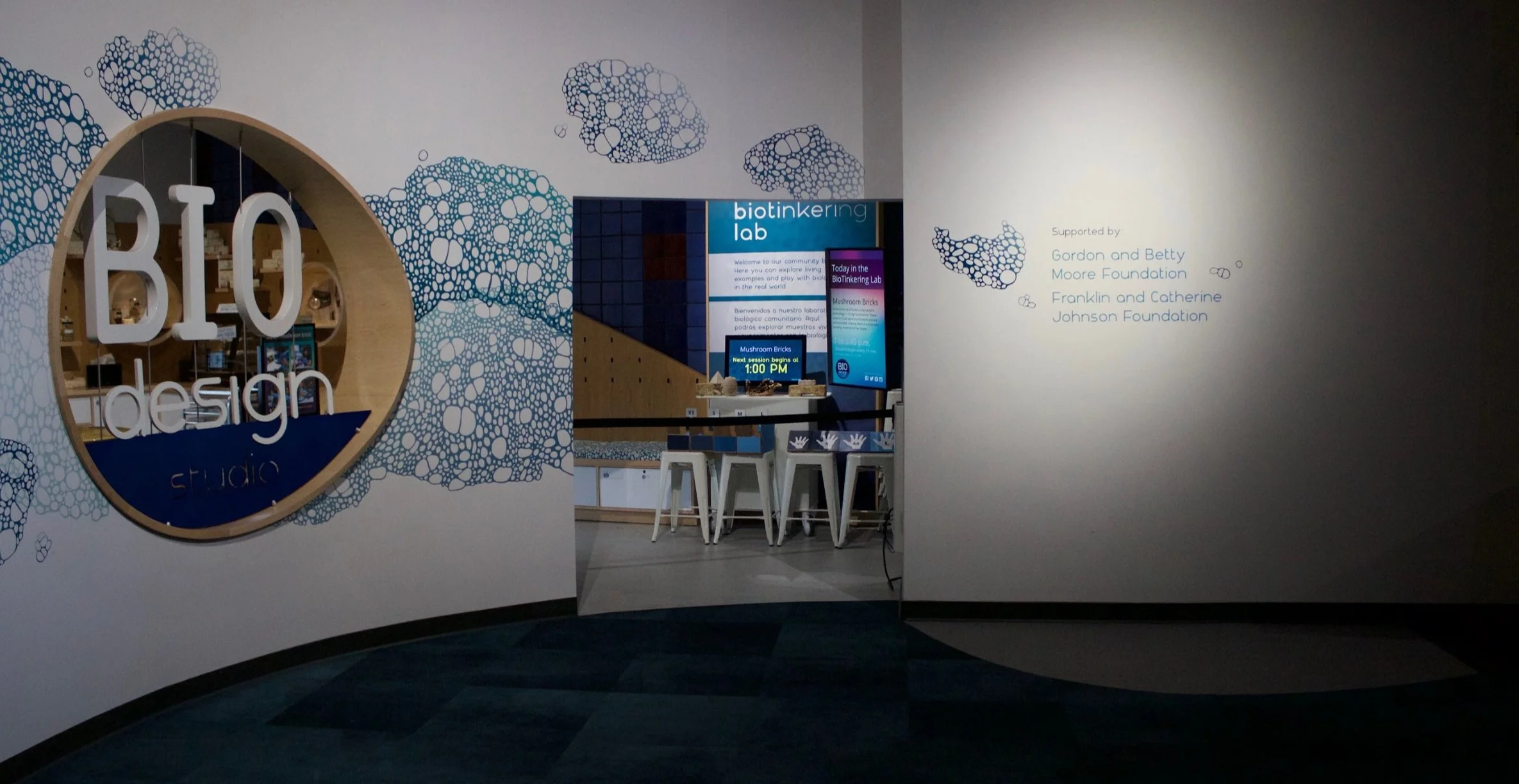
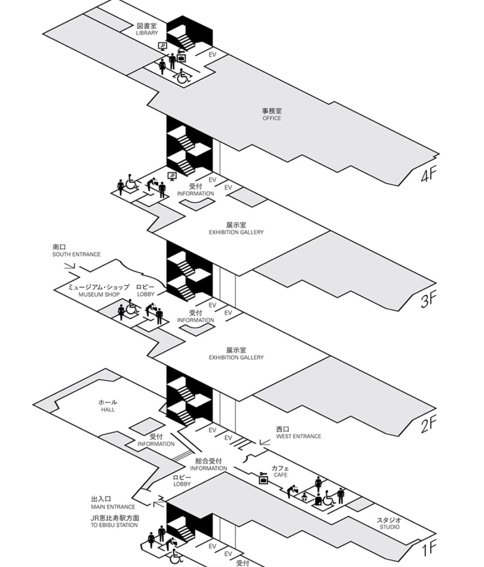
The initial step involved visiting the site in person to scout the area and assess the various signage elements in use.
Captured the essence and aesthetics while documenting areas for improvement and elements that could be repurposed.
Noticed an engaging and playful experience inspired by whimsical, STEM-driven, and creature-like elements, all embodying the mission:
"To inspire the innovator in everyone."
Research focused on:
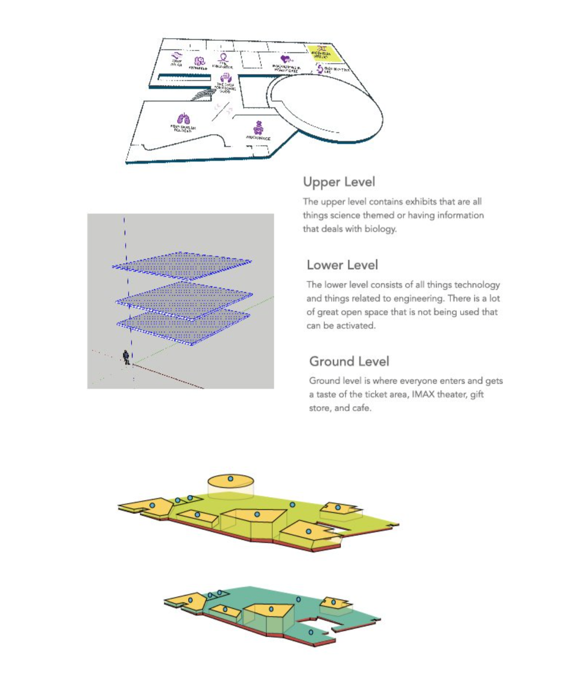
understanding visitor behavior, spatial flow, and key navigation challenges within the environment.
By analyzing existing signage and user interactions, we identified opportunities to improve clarity, accessibility, and brand alignment.
This informed our decisions on the new signage’s look and feel, ensuring a cohesive visual language that enhances both functionality and aesthetic appeal.
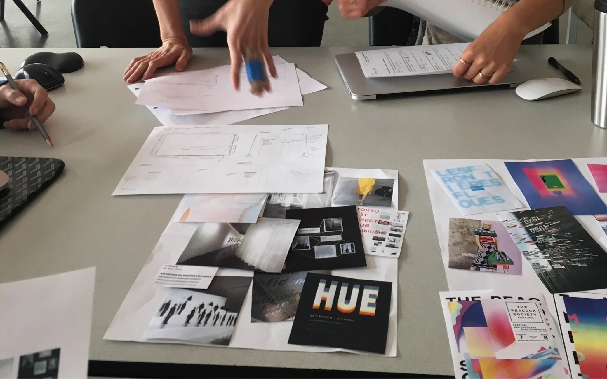
Brainstorm & Visuals
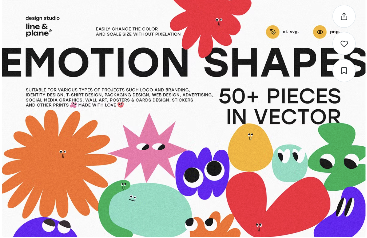
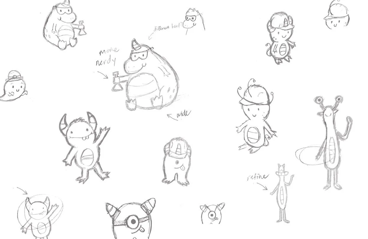
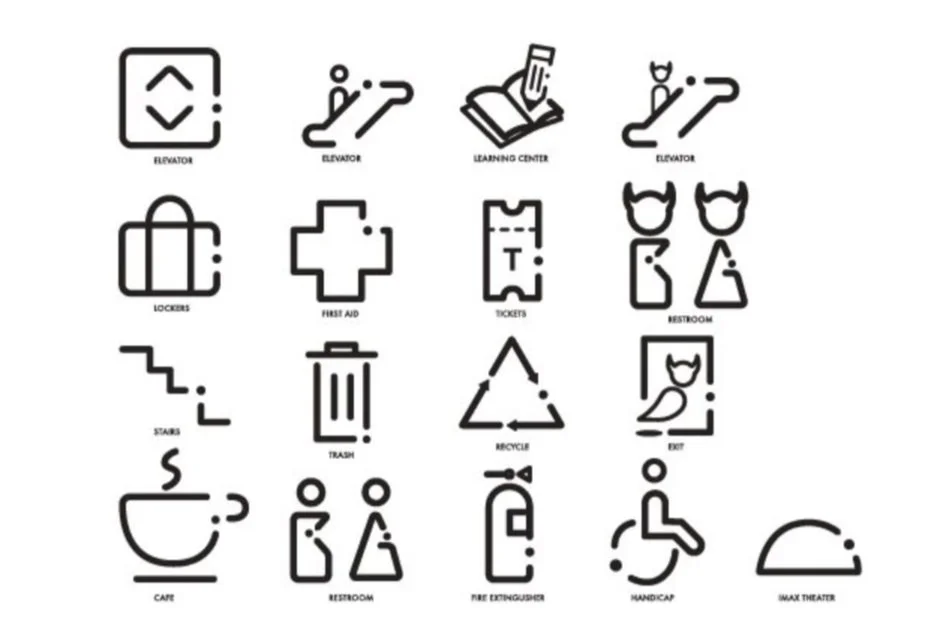
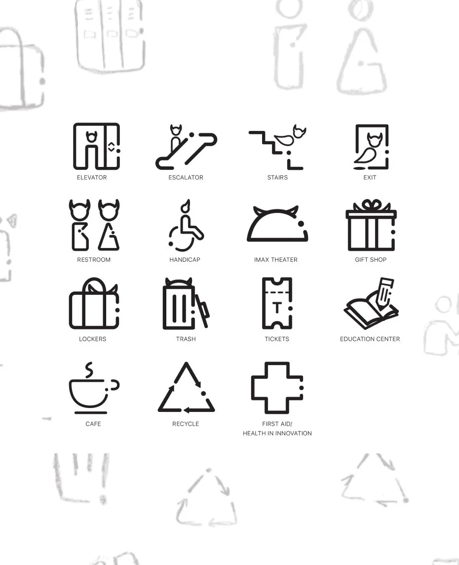
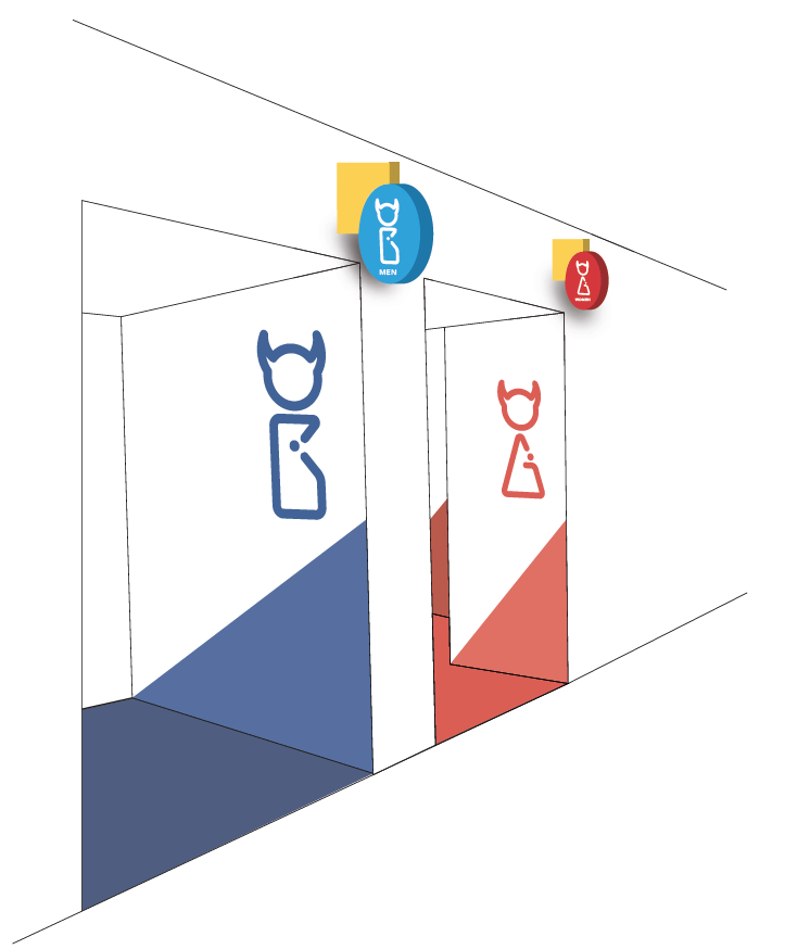
We decided that a friendly and approachable feel was essential, so we developed character sketches that embodied this tone and doubled as our icons.
Final Icons:
Group Version
The team and I aligned on this interpretation, addressing key challenges such as rebranding, signage, wayfinding, and infusing a playful touch—essential for a museum designed with children in mind.
Because design never stands still, I refined & updated a few elements …
Understanding the importance of adapting designs, I revisited and refined a few elements, incorporating my own approach—one that balanced a fresh, modern feel without being overly childish—while ensuring the updates aligned with the project’s vision and enhanced the overall experience.
Re-Brand Explained:
-
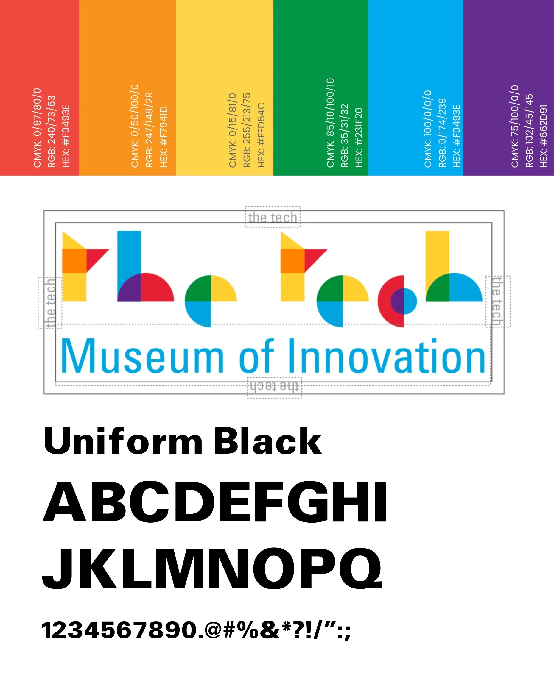
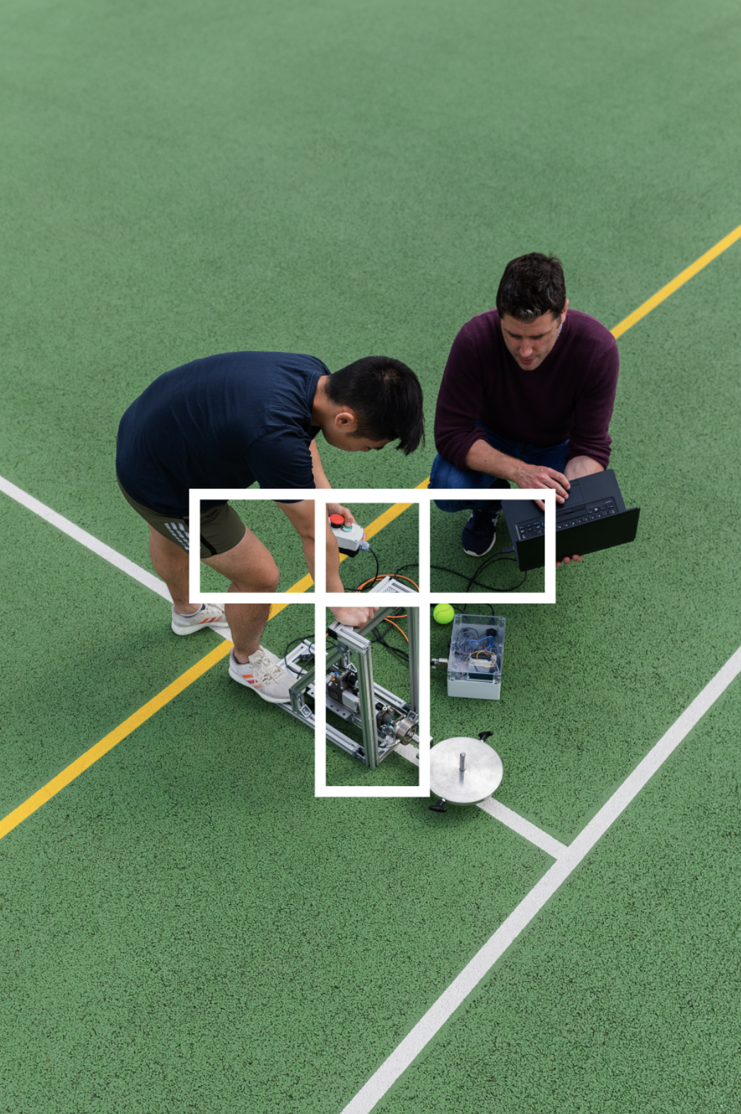
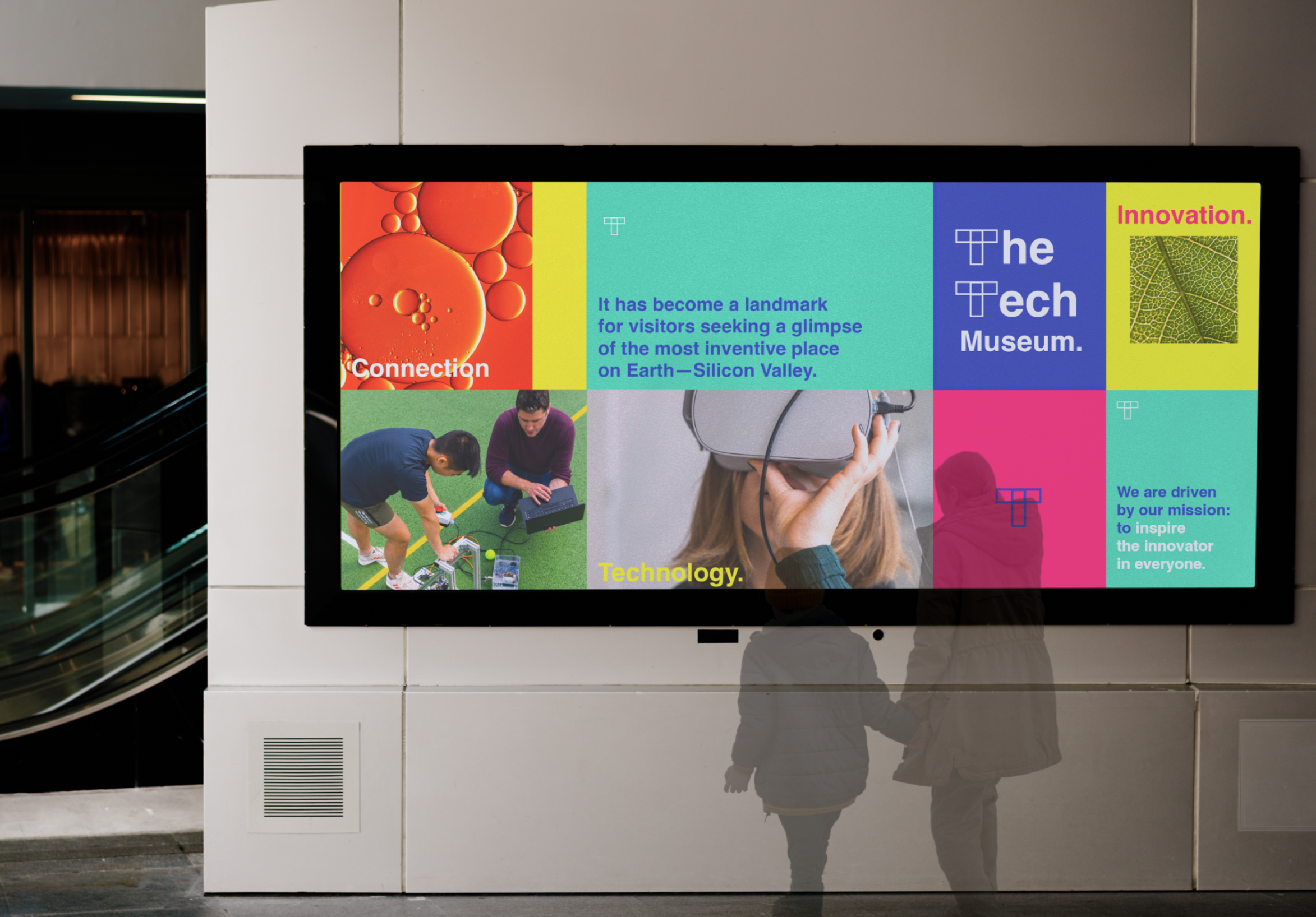
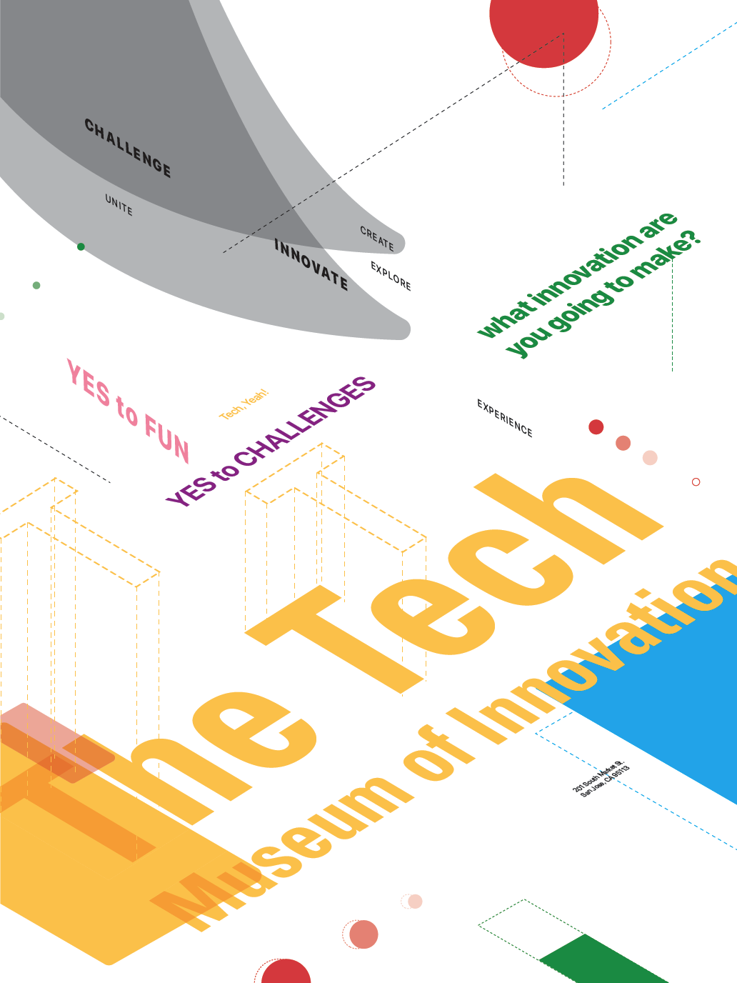
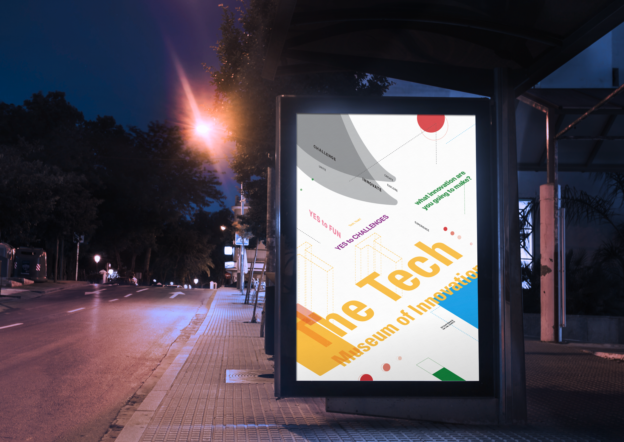
The Tech Museum's new logo captures the essence of connection, symbolizing innovation in its simplest form. This dynamic design reflects the inventive spirit inside while appealing to visitors of all ages. With bold visuals, thoughtful typography, and compelling imagery, this rebrand effectively embodies Silicon Valley’s spirit of innovation.
-
To stay true to my team's vision, I preserved the original creatures throughout the rebrand. We designed whimsical "creatures" to capture The Tech Museum’s spirit of innovation and play. These characters act as friendly guides, enhancing the wayfinding system and reinforcing the museum’s mission.
-
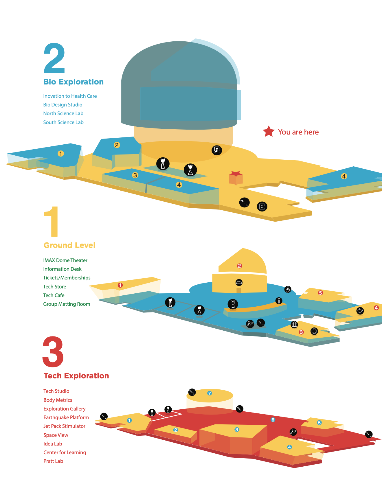
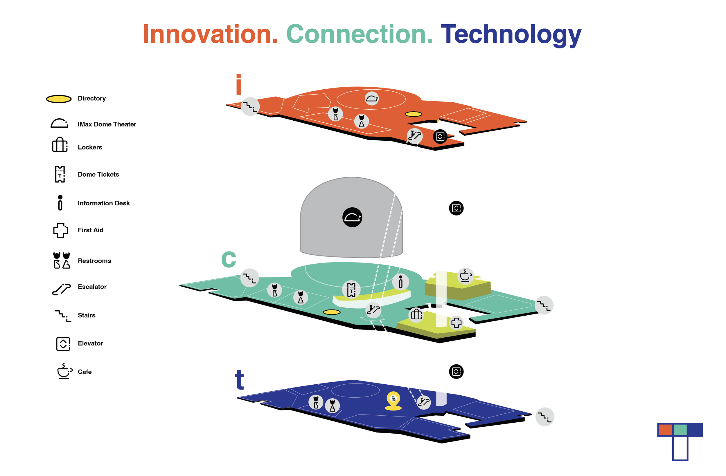
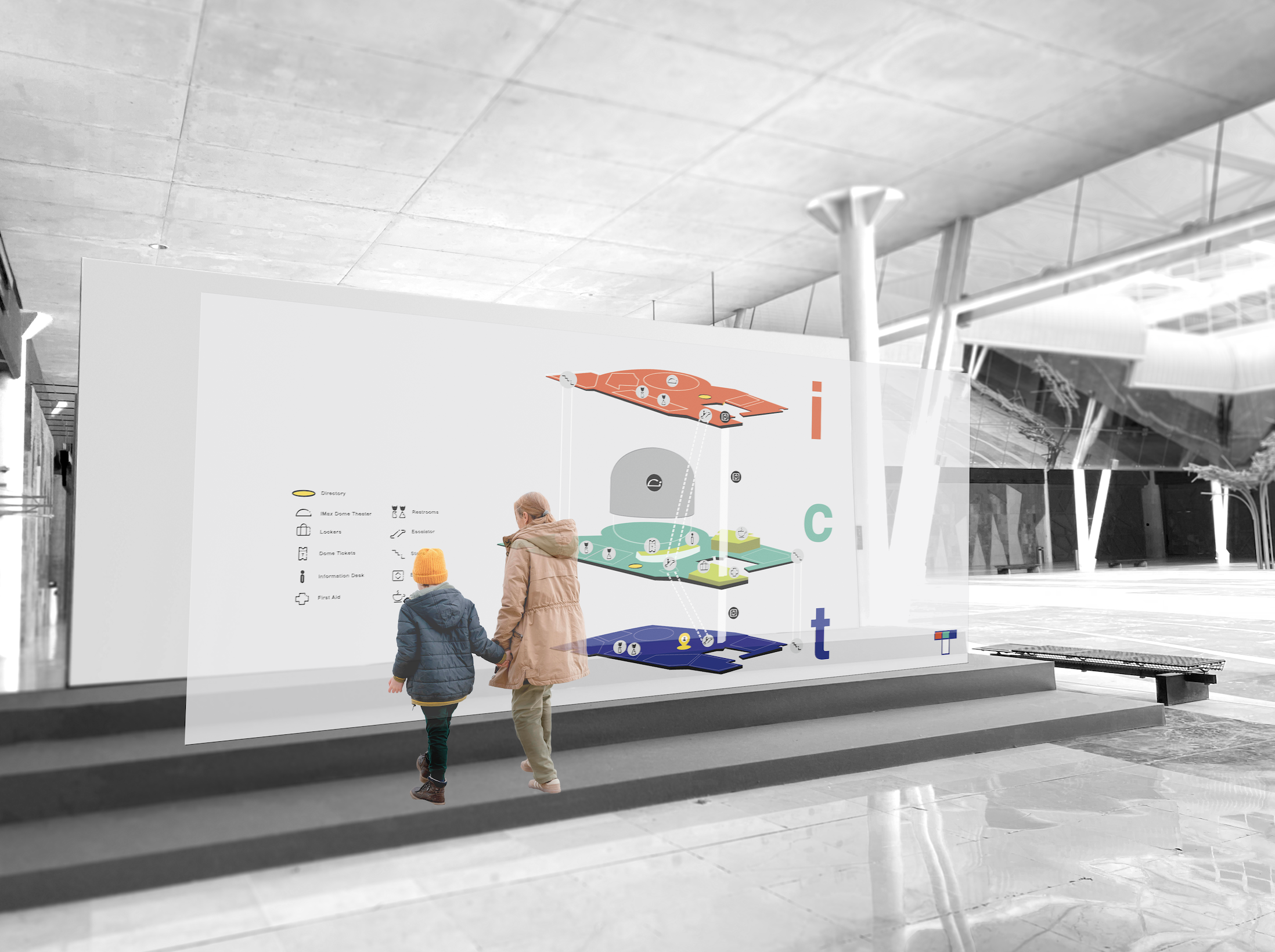
I redesigned the museum directory to enhance readability and navigation. The new layout clearly displays each floor, making it easy for visitors to identify their location and quickly find exhibits or amenities. This design provides a smoother, more intuitive experience for guests.
The idea of a projected map is something can be explored in the future.
In Conclusion,
While this rebrand could include more parts, it has successfully addressed the key challenge we set out to solve: creating a refreshed brand that resonates with audiences of all ages, while elevating the original identity and enhancing the exploration of the spaces.
Stay tuned as this project continues to evolve.

